skip to main |
skip to sidebar
When I saw this challenge from My Favorite Things recently, I knew I had to participate! I feel like I am one of a dying breed of people who still send handwritten cards. I loathe talking on the phone (a harsh side effect of the iPhone age), but I text a lot and I also love making and sending cards. It's just my little way of keeping alive the tradition of written correspondence. I made this card using Concord & 9th's Flourish stamp set for a dear, sweet 96-year-old lady who goes to my parents' church and who called and checked on our sweet #1 daughter during her last surgery and recovery. With so many people today being rather self-absorbed, I am always so grateful for those few people who take the time to care. They are such a blessing to me! Thanks for stopping by and have a blessed day!

 This week's colourQ challenge colors worked great as an alternative color scheme for this teacher appreciation card I need for next week. Believe it or not (and I didn't!), I had all the colors. I used Reverse Confetti's great stamp set, All Apples on white cardstock with a bit of Really Rust cardstock as an accent. Thanks so much for stopping by and have a great week!
 I can't believe I haven't blogged all month! I've made a few cards but I haven't participated in any challenges so no blogging. It's officially fall but, sadly, here in E. TN, it's still 90 degrees (we've had 76 days of 90+ degree temperatures), which is so discouraging when all I want to do is bake and make soup and drink coffee (if you haven't tried Starbucks new Chile Mocha, it is delicious and has replaced my go-to Pumpkin Spice Latte!). Anyway, for this week's colourQ challenge, I dug out my old SU! Carved and Candlelit set and stamped a few variegated pumpkins. And any day with pumpkins is the best day ever so the sentiment fits me perfectly! I didn't have soft suede so I subbed early espresso. Thanks for stopping by and have a great week!!
 Short and sweet today, folks. For this week's colourQ challenge, I used SU! Branch Out and Thoughts & Prayers, and I added a bit of embossing and a few sequins. Thanks for stopping by and have a great weekend!
 I have always wanted to make a cool graphic card like this, but I am so bad at 1.) stamping straight and 2.) getting good ink coverage. However, my mini MISTI helps me make some serious magic! I used the Boy Crazy stamp set from My Mind's Eye. I LOVE, LOVE, LOVE the Converse high-top stamp! For an easy sentiment, I used Everyday Circles by Neat & Tangled. Thanks for stopping by and have a great week!!
For this week's colourQ challenge, I used Sketch Ranunculus by Simon Says Stamp. I actually had three of the four colors this week and only had to substitute PTI's Hibiscus Burst for Blushing Bride. School starts next week and my older daughter starts 10th grade and my little one starts kindergarten. Kindergarten!! I can't believe it! She's super excited and I know she's ready but I will miss her. I'll miss having both my girls around. School is very important, of course, but it's so intense here, and I hate to see them in the rat race at such young ages. Thanks for stopping by and have a great weekend!
Since this card isn't part of a challenge, I know the only person who will see it is my friend, Mary Ann (hey, there!!), but I posted it anyway since I love it so much! I wanted to make an exceedingly Southern thank-you note, so I pulled out my new fave gingham background stamp from Hero Arts - can you believe this isn't patterned paper? I love this Mason jar stamp set and die from PTI and of course my love for Brushed Blooms is well-known! It is such a fantastic set!! The colors I used from PTI are Harvest Gold, Summer Sunrise, Simply Chartreuse. and Pure Poppy, and Tim Holtz's Blueprint Sketch, which is a surprisingly perfect shade of blue. You would think is would be entirely too bright, but it's the best. The sentiment is also one of my faves from PTI Mini Blooms. Thanks for stopping by, Mary Ann, and good luck when school starts next week! :D
 I really love this week's colourQ challenge colors! They are so bright and reminiscent of spring, which is nice since it's like 100 degrees here in East Tennessee. And if the heat doesn't make you completely miserable, then the humidity certainly will!! Anywho, I still don't have So Saffron (and I probably never will!), so I subbed my very favorite Daffodil Delight. This card, inspired by one I found on Pinterest, is very simple, but I like the way it turned out, and it would be a great card to make en masse, especially if you have a mini MISTI. Thanks for stopping by and have a great week!
 This week's colourQ challenge colors stumped me again. No Midnight Muse or Concord Grape here. I used Tim Holtz's Faded Jeans and PTI Royal Velvet instead. My card was inspired by one I found on PTI's website. I don't use Circle Scribbles much although I'm sure I had high hopes for it when I bought it. Isn't that what always happens? I see a stamp set I love and many, many ways to use it so I order it, and then, by the time it arrives, I have no idea what I wanted to create with it! Happens. Every. Time. Hope y'all had a great weekend! Thanks for stopping by!
 So, my colors are a bit off, but I love the way my card for this week's colourQ challenge turned out! I do not have a light pink but I am going to have to get one. SU!'s new Flirty Flamingo is the lightest pink ink I own. Since I used my MISTI, I was able to stamp multiple times to get different shades of the same color which is pretty fantastic! I also subbed Daffodil Delight for So Saffron. The background is by Hero Arts and I ADORE it!! It's been a little tricky to stamp perfectly but shabby chic is still in so my imperfections are, too. Thanks for stopping by and have a great weekend!!
 For someone who loves blues as much as I do, I didn't have Island Indigo or Marina Mist for this week's colourQ challenge, so I subbed Tim Holtz's Peacock Feathers and Broken China. The stamp sets I used are PTI Painted Petals (limited edition anniversary set - get it if you can!!) and SU! All About Everything. And, as usual, when I don't have all the colors, I have trouble with the design so this is all I've got this week. Here's hoping I have more to offer next week. Have a great night!!
 I love this week's colourQ challenge colors! They are so bright and summery, and I had them all which is a minor miracle. I really miss Certainly Celery. I still have a decent ink pad but just a few scraps of cardstock. I found the inspiration for this card on Pinterest and I love the polka dots. They are so much fun and these colors work perfectly for a summer birthday card. The sentiment is from PTI's A Day at the Beach. Thanks for stopping by and have a great holiday weekend!!
So, I know that no one will see this except my friend, Mary Ann (hey!!), but I really like how it turned out so I wanted to share it. Every summer, my #1 daughter goes to the beach with a friend and her family, and I send snacks for the road. This year's request is muddy buddies - they practically inhale them! But I can't just send little loose bags of snacks - they have to have a cute little container to keep them in, and this year's container has a soccer theme since the family is very much into soccer. Isn't it the cutest?!?! Thanks for stopping by and have a great day!
 This week's colourQ challenge colors were indeed challenging, but I found some inspiration on Instagram and was able to knock out this card without too much trouble. I used Simon Says Stamp's newer set, Sketch Ranunculus, along with PTI's Mini Blooms (seriously, one of the most versatile stamp sets ever!). The white frame I die cut needed some grounding against the white card base, so I added two little enamel dots that I had on my craft table. Crafters love to improvise, don't we? I'm sorry for the shadow on my picture. I am having a bit of trouble successfully lighting my cards. Thanks for stopping by and have a great week!
 This week's colourQ challenge colors are perfect for a Fathers' Day card. I found the inspiration for this card on Pinterest using Washi tape, but I didn't have the correct colors, so I embossed and cut cardstock to resemble Washi tape. I used SU!'s Gorgeous Grunge for a little splatter action and my Silhouette to cut "Dad," which I popped up with dimensionals. Quick and easy Fathers' Day card! Thanks for stopping by and have a great weekend!
 There are so many beautiful projects to pick from for this month's PTI Create Along with Us challenge, but I think Betsy Veldman's card is my favorite. I used my favorite Brushed Blooms with PTI Pure Poppy and SU! Flirty Flamingo. I cut the sentiment using my Silhouette and the Channel font. The sentiment is from Neat & Tangled's Scandinavian Prints. Thanks for stopping by and have a great evening!
 This week's colourQ challenge colors stumped me again! I must be losing my creative mojo. Anyway, I saw the inspiration for this card on Pinterest and thought these colors would be perfect for a Fathers' Day card. As I look at the picture now, the Taken with Teal looks more like Pacific Point, but I promise it's not. I'm having phone/picture/computer problems. I actually had all the colors this week and didn't use any stamping. I had hoped to find some teal sticker letters in my stash but it was not to be so I used my Silhouette to cut out #1 DAD. Luckily, it only took me 32 tries. :( Thanks so much for stopping by and have a great day!!
 This week's colourQ challenge colors did not work for me at all - this is my third try! I needed a sympathy card for a dear sweet friend who lost her sister last week and I think the way I put together these colors works well. I put down a light wash of Coastal Cabana on a piece of watercolor paper and, when it finally dried, I used the remaining colors to stamp the flowers and stems, all from vintage stamp sets, SU! Heartfelt Thanks and PTI Life. Thanks for stopping by and have a blessed Sunday afternoon.


 This week's colourQ challenge colors worked great as an alternative color scheme for this teacher appreciation card I need for next week. Believe it or not (and I didn't!), I had all the colors. I used Reverse Confetti's great stamp set, All Apples on white cardstock with a bit of Really Rust cardstock as an accent. Thanks so much for stopping by and have a great week!
 I can't believe I haven't blogged all month! I've made a few cards but I haven't participated in any challenges so no blogging. It's officially fall but, sadly, here in E. TN, it's still 90 degrees (we've had 76 days of 90+ degree temperatures), which is so discouraging when all I want to do is bake and make soup and drink coffee (if you haven't tried Starbucks new Chile Mocha, it is delicious and has replaced my go-to Pumpkin Spice Latte!). Anyway, for this week's colourQ challenge, I dug out my old SU! Carved and Candlelit set and stamped a few variegated pumpkins. And any day with pumpkins is the best day ever so the sentiment fits me perfectly! I didn't have soft suede so I subbed early espresso. Thanks for stopping by and have a great week!!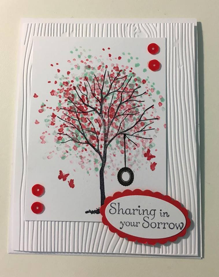
 Short and sweet today, folks. For this week's colourQ challenge, I used SU! Branch Out and Thoughts & Prayers, and I added a bit of embossing and a few sequins. Thanks for stopping by and have a great weekend!
 I have always wanted to make a cool graphic card like this, but I am so bad at 1.) stamping straight and 2.) getting good ink coverage. However, my mini MISTI helps me make some serious magic! I used the Boy Crazy stamp set from My Mind's Eye. I LOVE, LOVE, LOVE the Converse high-top stamp! For an easy sentiment, I used Everyday Circles by Neat & Tangled. Thanks for stopping by and have a great week!!


 This week's colourQ challenge colors stumped me again. No Midnight Muse or Concord Grape here. I used Tim Holtz's Faded Jeans and PTI Royal Velvet instead. My card was inspired by one I found on PTI's website. I don't use Circle Scribbles much although I'm sure I had high hopes for it when I bought it. Isn't that what always happens? I see a stamp set I love and many, many ways to use it so I order it, and then, by the time it arrives, I have no idea what I wanted to create with it! Happens. Every. Time. Hope y'all had a great weekend! Thanks for stopping by!
 So, my colors are a bit off, but I love the way my card for this week's colourQ challenge turned out! I do not have a light pink but I am going to have to get one. SU!'s new Flirty Flamingo is the lightest pink ink I own. Since I used my MISTI, I was able to stamp multiple times to get different shades of the same color which is pretty fantastic! I also subbed Daffodil Delight for So Saffron. The background is by Hero Arts and I ADORE it!! It's been a little tricky to stamp perfectly but shabby chic is still in so my imperfections are, too. Thanks for stopping by and have a great weekend!!
 For someone who loves blues as much as I do, I didn't have Island Indigo or Marina Mist for this week's colourQ challenge, so I subbed Tim Holtz's Peacock Feathers and Broken China. The stamp sets I used are PTI Painted Petals (limited edition anniversary set - get it if you can!!) and SU! All About Everything. And, as usual, when I don't have all the colors, I have trouble with the design so this is all I've got this week. Here's hoping I have more to offer next week. Have a great night!!
 I love this week's colourQ challenge colors! They are so bright and summery, and I had them all which is a minor miracle. I really miss Certainly Celery. I still have a decent ink pad but just a few scraps of cardstock. I found the inspiration for this card on Pinterest and I love the polka dots. They are so much fun and these colors work perfectly for a summer birthday card. The sentiment is from PTI's A Day at the Beach. Thanks for stopping by and have a great holiday weekend!!

 This week's colourQ challenge colors were indeed challenging, but I found some inspiration on Instagram and was able to knock out this card without too much trouble. I used Simon Says Stamp's newer set, Sketch Ranunculus, along with PTI's Mini Blooms (seriously, one of the most versatile stamp sets ever!). The white frame I die cut needed some grounding against the white card base, so I added two little enamel dots that I had on my craft table. Crafters love to improvise, don't we? I'm sorry for the shadow on my picture. I am having a bit of trouble successfully lighting my cards. Thanks for stopping by and have a great week!
 This week's colourQ challenge colors are perfect for a Fathers' Day card. I found the inspiration for this card on Pinterest using Washi tape, but I didn't have the correct colors, so I embossed and cut cardstock to resemble Washi tape. I used SU!'s Gorgeous Grunge for a little splatter action and my Silhouette to cut "Dad," which I popped up with dimensionals. Quick and easy Fathers' Day card! Thanks for stopping by and have a great weekend!
 There are so many beautiful projects to pick from for this month's PTI Create Along with Us challenge, but I think Betsy Veldman's card is my favorite. I used my favorite Brushed Blooms with PTI Pure Poppy and SU! Flirty Flamingo. I cut the sentiment using my Silhouette and the Channel font. The sentiment is from Neat & Tangled's Scandinavian Prints. Thanks for stopping by and have a great evening!
 This week's colourQ challenge colors stumped me again! I must be losing my creative mojo. Anyway, I saw the inspiration for this card on Pinterest and thought these colors would be perfect for a Fathers' Day card. As I look at the picture now, the Taken with Teal looks more like Pacific Point, but I promise it's not. I'm having phone/picture/computer problems. I actually had all the colors this week and didn't use any stamping. I had hoped to find some teal sticker letters in my stash but it was not to be so I used my Silhouette to cut out #1 DAD. Luckily, it only took me 32 tries. :( Thanks so much for stopping by and have a great day!!
 This week's colourQ challenge colors did not work for me at all - this is my third try! I needed a sympathy card for a dear sweet friend who lost her sister last week and I think the way I put together these colors works well. I put down a light wash of Coastal Cabana on a piece of watercolor paper and, when it finally dried, I used the remaining colors to stamp the flowers and stems, all from vintage stamp sets, SU! Heartfelt Thanks and PTI Life. Thanks for stopping by and have a blessed Sunday afternoon.



 Posts
Posts


